Email: office@boldimaging.com
Phone: 647-229-2369
Before and After: Home Staging Reveal
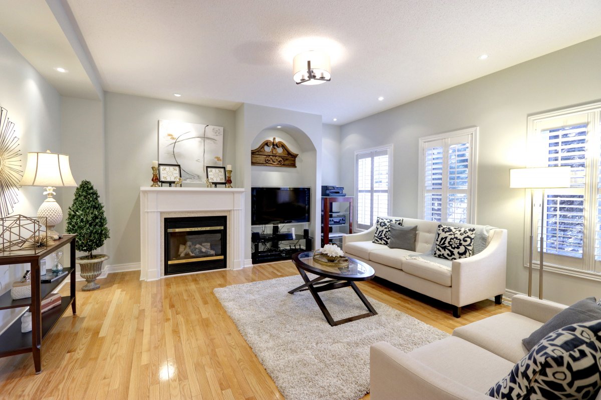
Who doesn't love a great before and after reveal?! And have we got one for you today!
Our big project is all wrapped up and so it's finally time to share the before and after photos!!!
And boy are they good!
This project had a much larger scope than most of our staging jobs, because it included:
Painting
Painting the whole house, our suggested paint colour.
Lighting Upgrades
Changing all the lighting to our suggested lighting options.
Mirrors
Changing out the ensuite mirrors.
Furniture
Renting furniture for the living room and family room.
Staging
Staging the enitre home, including artwork.
The Final Reveal
So now that our big project is done, it's time to see it all come together!
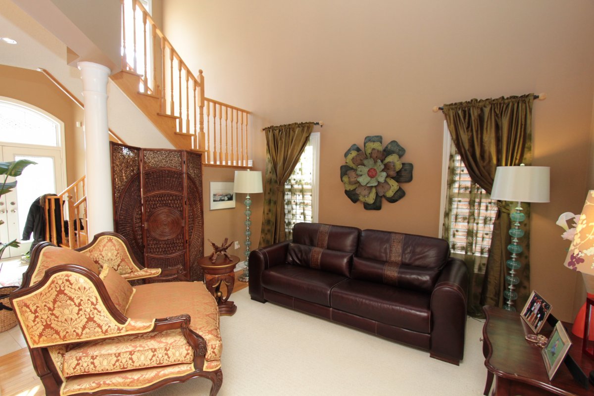
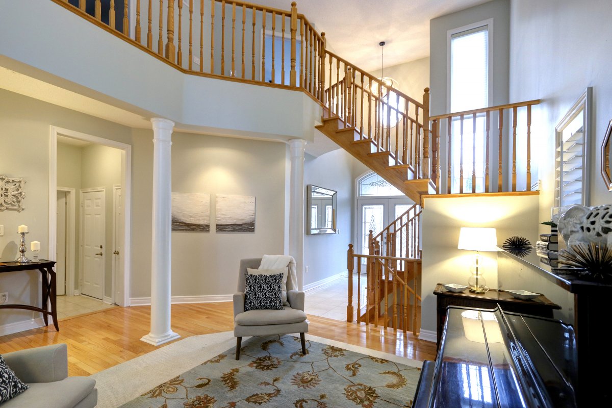
The Living Room
The living room and front enterance really benefited from a lighter paint colour and furnishings.
It doesnt look sparce, but rather open and airy.
Before:
After:
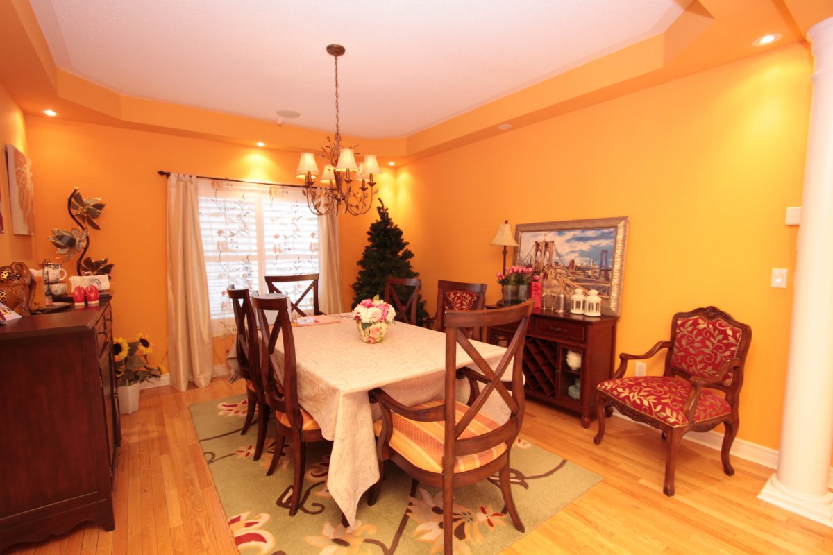
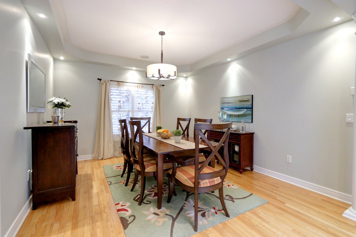
The Dining Room
In the dining room we removed the light fixture, artwork and any other extra items. Then we
changed the wall colour, replaced the light fixture and added our own art work.
Before:
After:
The Family Room
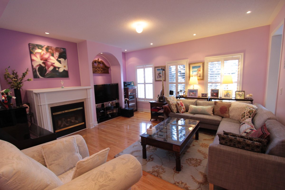
The family room took on quite the transformation. Sometimes it's shocking what a coat of paint
can do for changing a space! By changing the pink walls to a light grey, keeping the trim white
and replacing the lighting, it changed the entire look of the room. We also added some lighter
coloured furniture and curated decor.
Before:
After:

The Kitchen
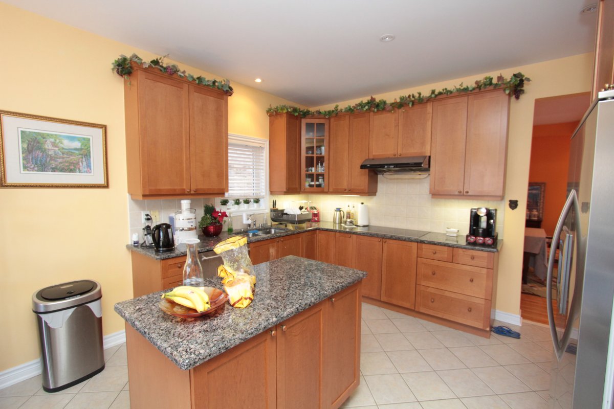
The kitchen is always important to home buyers, so allowing the kitchen's strengths to shine is
important. Clearing counters and removing dated decor is a great place to start.
Then by a choosing a cooler wall colour and replacing cupboard hardware it really showed off the
countertops and stainless steel appliances, giving the kitchen a more modern feel.
Before:
After:
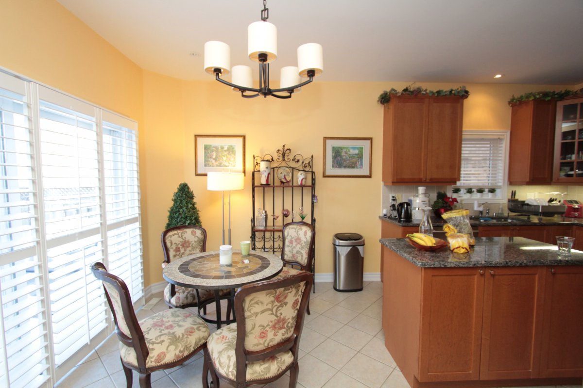
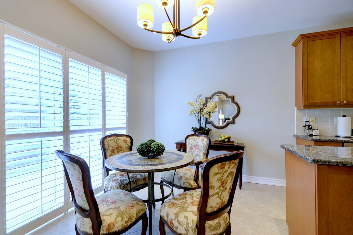
The Eating Area
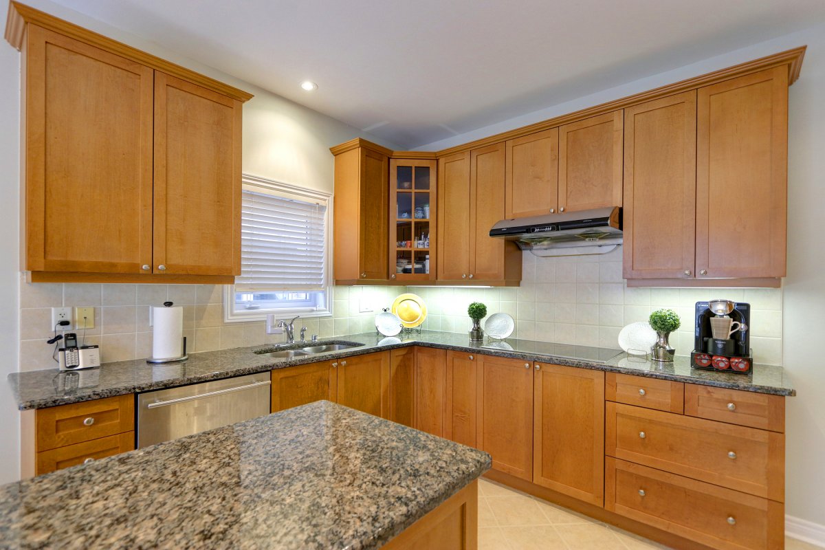
The eating area just off the kitchen looks more open with the new paint colour and less clutter.
Rather than drawing attention away from the kitchen, it compliments it.
Before:
After:
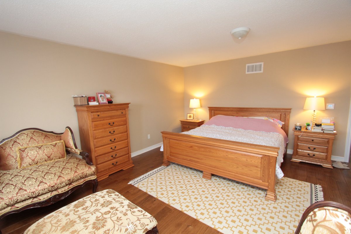
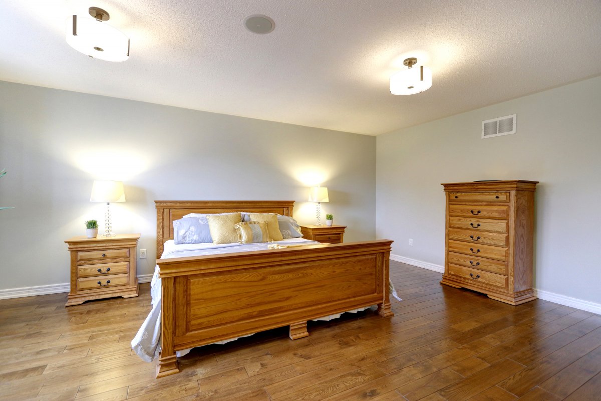
The Master Bedroom
With a change in ceiling lighting and repositioning of furniture, plus the update in paint colour,
the master bedroom was given a face lift. Less furniture and accessories made the room feel
more spacious. New bedding and artwork made the space feel warm and inviting without being
too personal for potential home buyers.
Before:
After:
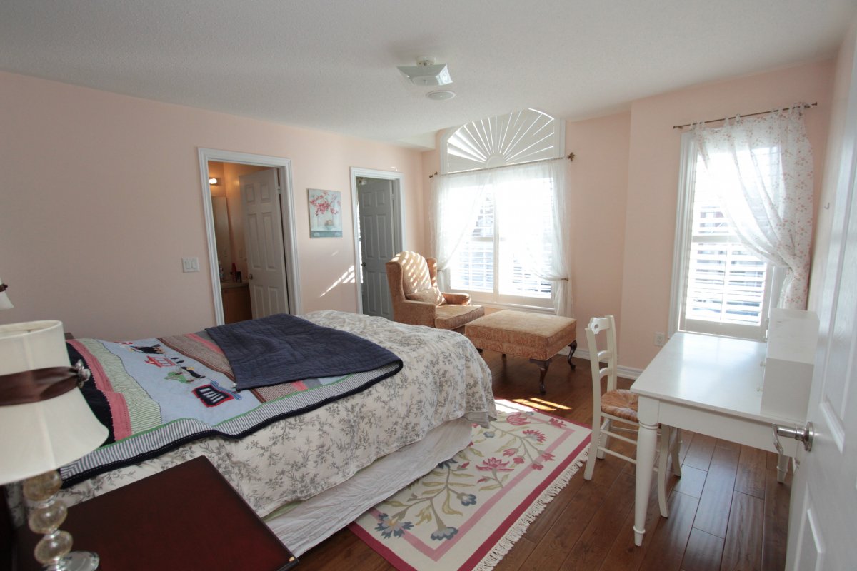
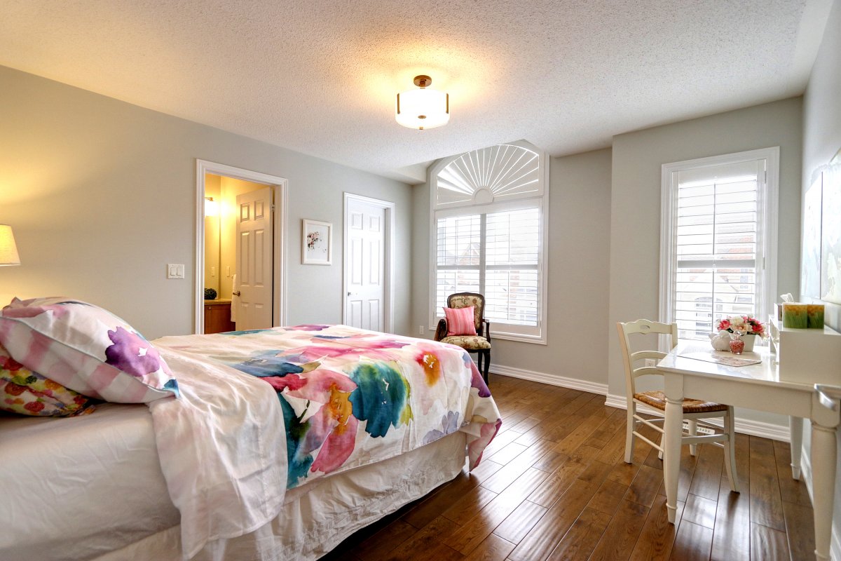
The First Bedroom
When it came to the first bedroom we changed the lighting, painted the walls, removed the rug
and the curtains (so the windows could showcase themselves). Then we brought in a smaller scale
chair and added cheery bed linens, but kept the desk and repurposed the artwork.
Before:
After:
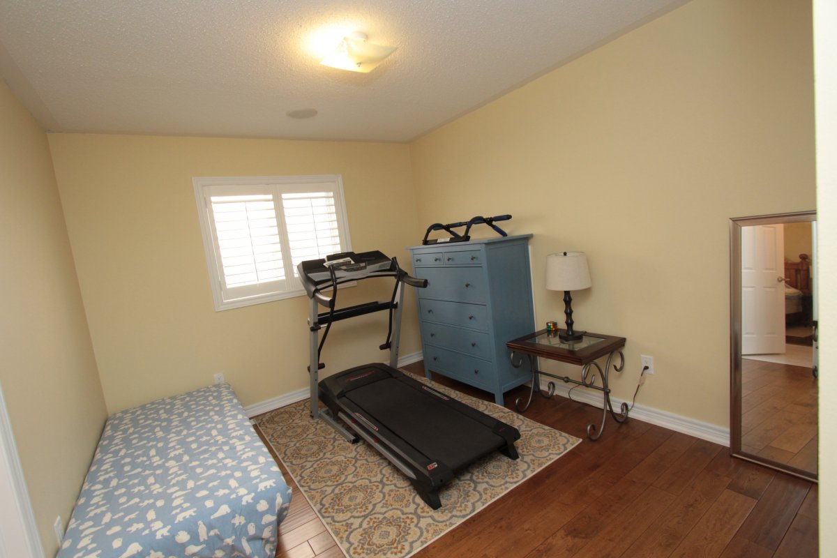
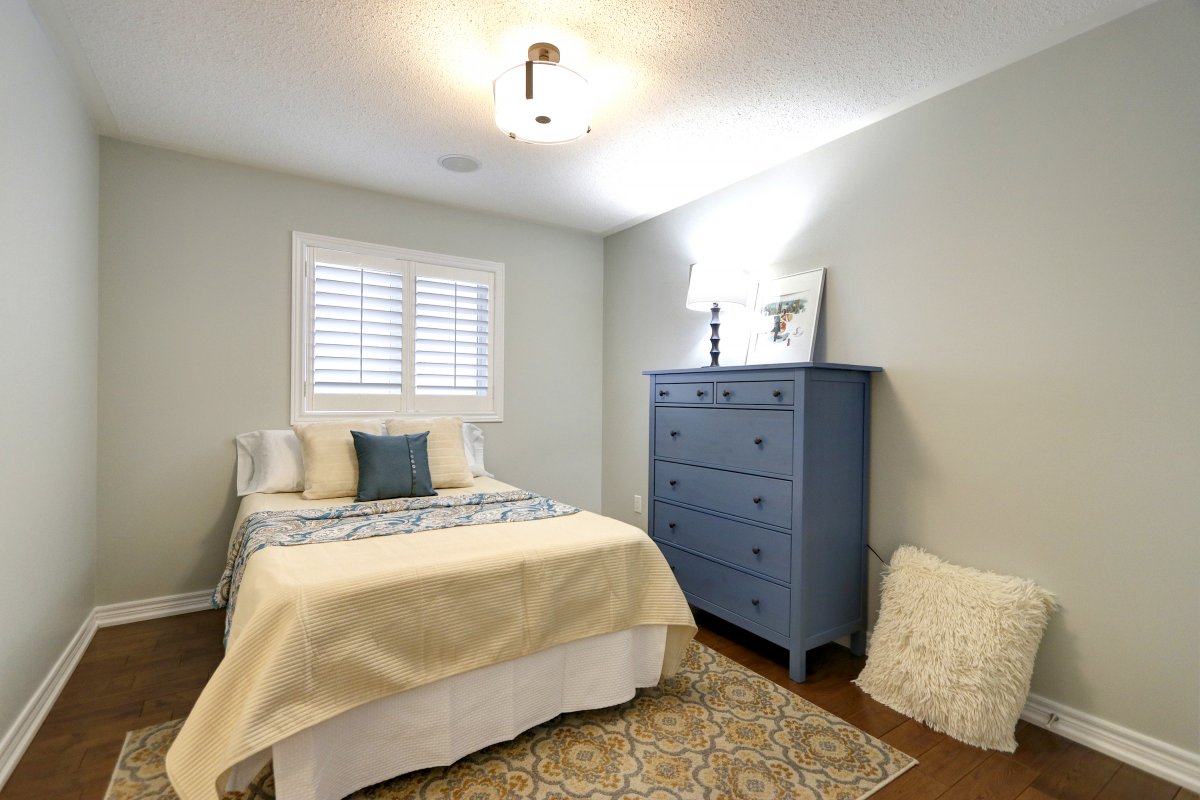
The Second Bedroom
Once again changing lighting and colour was the basis for updating the second bedroom. A
blue and yellow colour scheme made for a simple, but inviting space.
Before:
After:
The Jack and Jill Bathroom
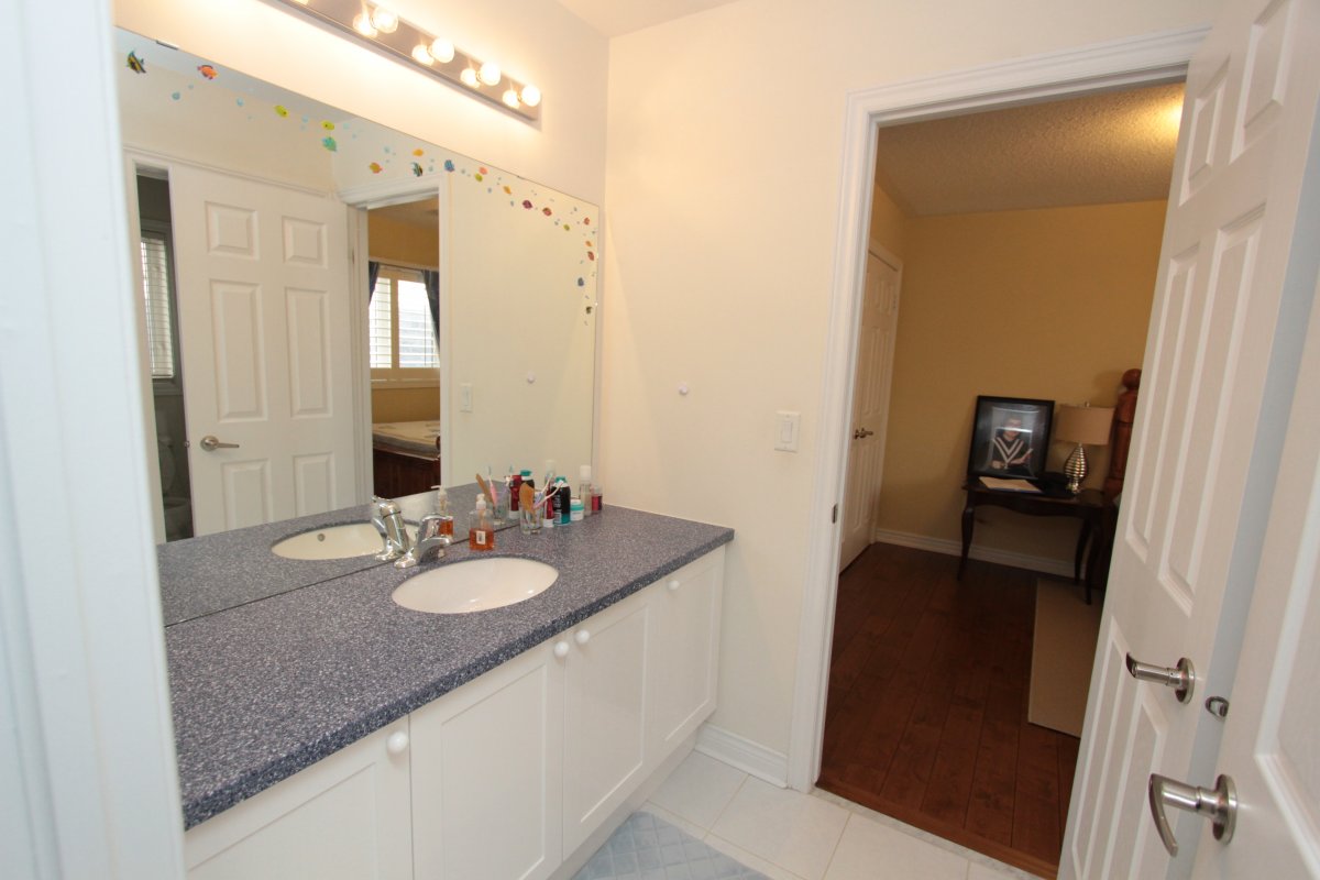
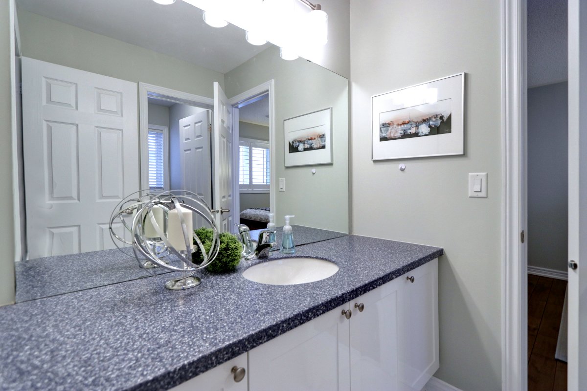
The Jack and Jill bathroom received a new coat of paint and new lighting. The removal of the mirror
decals and new handle hardware made for a much more polished look.
Before:
After:
Master Bedroom Ensuite Bathroom
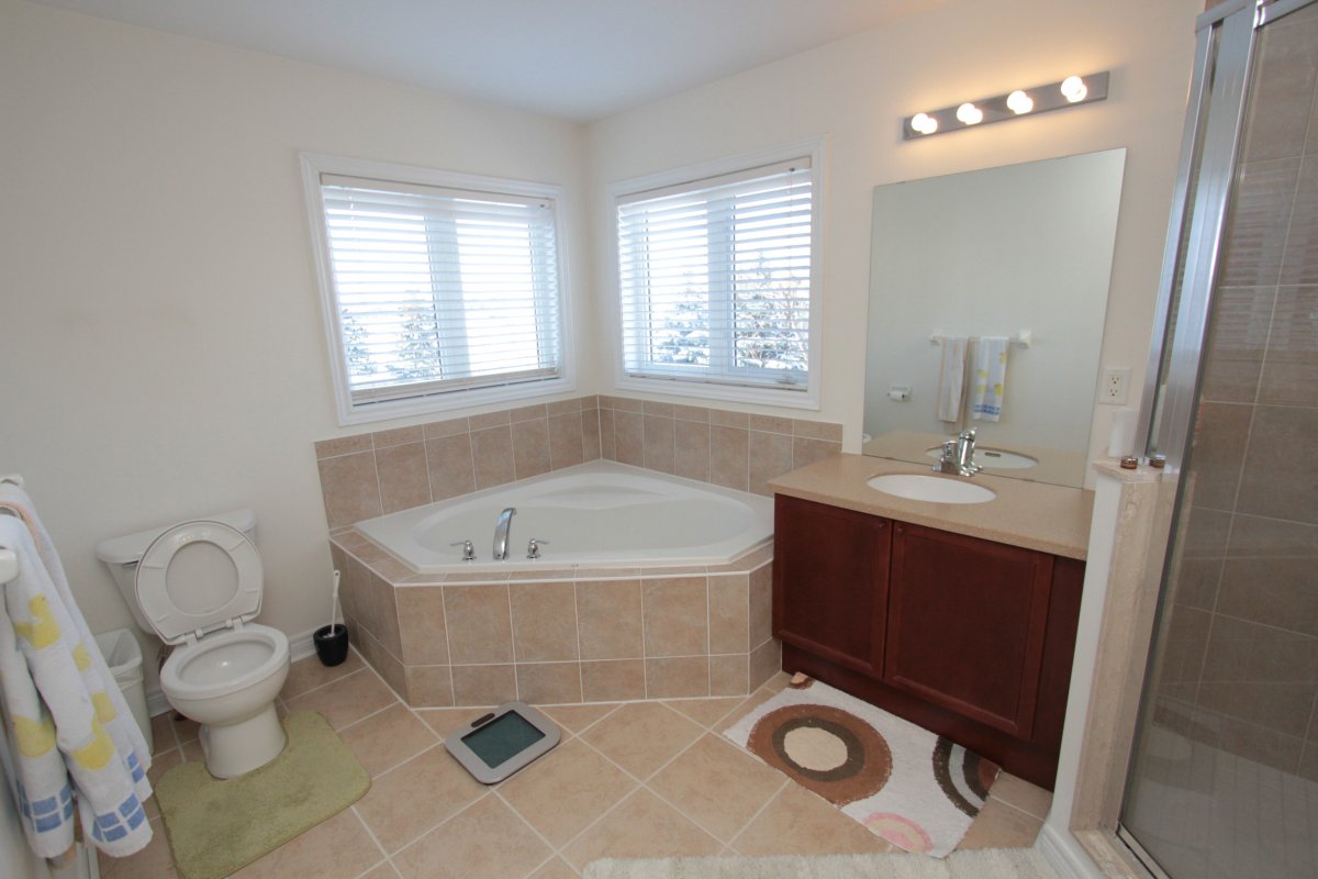
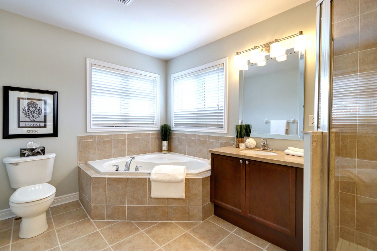
Updating the mirror (find our tutorial here) and lights, and removing personal effects helped to
show off the bathroom's best features!
Before:
After:
Staging Makes All The Difference
If you have ever doubted the difference good lighting, paint colours, mirrors and furniture make
to staging a home, it's safe to say the pictures speak for themselves! When it comes to home
staging and colours, less is more - you want perspective buyers to be able to picture their own
things and decor in the space, while still giving the idea of what it could be. Light and airy, open
spaces can give an inviting feel without feeling too full of someones else's memories. Our years
of expertise and experience give us an excellent eye for this. We love wowing home owners and
Real Estate agents with our final staged space. Plus the drama of a reveal is always fun to share!
© Copyright BOLD Imaging Inc., 2011-2020. All Rights Reserved. Site developed by LiquidCMS

